Tuesday, 11 October 2016

Lecture 3

Our guest lecturer today was Hannah Berrigan who works as a casting director within the theatre industry.
  • Studied English at Oxford then Drama
  • Worked as a director since 2002
  • Likes to divert away from the mainstream
Berrigan worked on the play Public Property which ran for three weeks at Trafalgar Studios in London. She stated that she was fond of the scripts involvement of gay characters, but it wasn't necessarily about being gay. I thought this was interesting that she consciously considers the representation of characters when choosing what work to get involved in. The story had fast paced, witty humour, similar to in Friends.

Advice on castings:
  • Trust your instincts
  • Don't let the actors feel more experienced than you
  • Be confident in selling the project- make it sound good
  • Get everyone to read same thing in order to judge fairly
  • Make notes about each person
Overall, I'm not sure how much of the lecture related to myself as an animator, however I think her advice on casting would be useful for considering voice actors as well.

Thursday, 6 October 2016

Practical 3

In class today we looked at a range of examples of how genre is explored in animation. Many of the pieces we looked at were hybrid genres.


Persepolis (2007)
  • Documentary animation, with elements of comedy and romance
  • Black and white, flat images
  • Based on graphic novel of same name, which is based on the writer's life


The Congress (2013)
  • Sci-fi, drama
  • Mixes animation and live action


The Triplets of Belleville (2003)
  • Comedy, period film
  • Time context - references to Josephine Baker


Waltz With Bashir (2008)
  • Animated war documentary
  • Based on Lebanese war


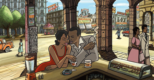
Chico and Rita (2010)
  • Musical, romance, adult
  • Animation influenced by Jazz music


Grave of the Fireflies (1988)
  • War, drama
I think the typical perception of animation is that it's usually fairytale based and aimed at children. But this class proved the diversity within animation. 

In the second half of class, we explored using the Adobe Animate software. I found it much more tricky to use than what I was used to (i.e. Illustrator and After Effects), and I thought it took much longer to do simple movements.

Wednesday, 5 October 2016

Colour Palettes

Different types of colour palette:

  • Analogous - using colours that are close to each other on the colour wheel; not much difference in hue
  • Complementary - using colours that are opposite each other on the colour wheel
  • Triadic - three main colours equally spaces on the colour wheel; adds diversity
  • Monochromatic - using different shades of the same hue
Current trends
  • Pastels - often used in "flat" design; use between 4-5 primary colours
  • Bright - bright, saturated colours

There are numerous websites that help to create colour palettes such as:

  • Adobe Kuler - can be synched with the creative cloud

In animation, colour scripts can be used to see the overall look and feel for the project. This can help identify how well the colour palettes work together:


https://www.smashingmagazine.com/2010/02/color-theory-for-designer-part-3-creating-your-own-color-palettes/

http://www.dtelepathy.com/blog/design/color-theory

http://pixar-animation.weebly.com/colour-script.html


Viewing Log: Somewhere Down the Line


Director: Julien Regnard
Animation: Cartoon Saloon
Process: Used a combination of 2D and 3D animation

"For the characters animation, it was pretty simple because they are drawn in 2D, we used a software called TvPaint and then did simple compositing. The tricky part was the car and the animated background. We had to paint all the views of the car in Photoshop and then project them onto the 3D model. Same for the rolling backgrounds, we painted several views of the landscape and then projected them on a 3D map. It took us a while to figure it out but in the end it was working fine."

Why I'm inspired

  • Dynamic camera movement
  • Realistic sound design - creates an eerie effect
  • Cinematic

  • Flat-design animation with use of texture
  • Minimal character movement. The message is still put across even though the animation isn't perfectly realistic or fluid.


  • I like the neutral, washed out colour palette. I would like to look further into using a certain colour palette to enhance my own work.


  • Great use of lighting


  • Lots of detail placed into the scene, yet the art style is still quite rough, i.e. the texture in the background isn't fully blended. This relates back to the lecture we had last week about the photographer Nan Goldin. John Marchant suggested that it was the slight imperfections in Goldin's work that made it so great. I think this would apply to the animation.


Tuesday, 4 October 2016

Workshop 3

Modes

  • Telling stories
  • Genre
  • Form - straight animation, digital media etc.
  • Historical context
  • Linear or non-linear narrative
  • We must identify narrative, context and themes
  • The genre we chose will influence the setting
  • Typically stories include binary oppositions
  • Hybrid/blended genres
  • Stories tend to follow a hero's journey
  • Analysis of protagonist - identity; back-story; relationship to societal norms
  • How is music/light usesd
  • We are allowed to adapt an existing story - check scholarly writing
Ways of Making
  1. Cinematic - realism
  2. Documentary - Bill Nichols '6 modes'
  3. Digital media - interactive; linear etc.
  4. Animation - doc, cinematic, interactive, story
  5. Hybrid -  drawing inspiration from multiple sources
Lateral connections
  • Have previous years inspired us?
  • Core theory, practice and options
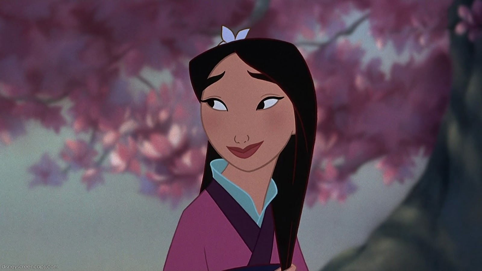
Inspiration - Mulan (1998)


Genre: Drama, musical, family
Context: based on a Chinese poem about a legend
Form: 2D animation

The main character, Mulan, flouts societal norms by dressing up as a man and entering the war in her father's place.
The film is visually pleasing, despite it's relatively simple, flat-design style.

Monday, 3 October 2016

Experimentation

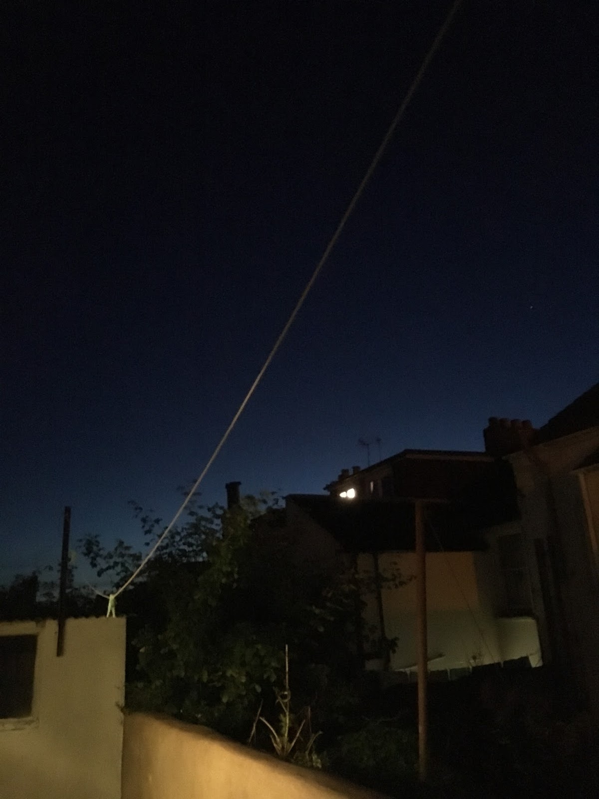
I was out in the garden this evening and noticed that the sky looked really pretty. This gave me a sudden burst of inspiration.


I took a picture to use as a reference (although the photo didn't do reality justice).


I followed my usual method, beginning by drawing the basic outline on illustrator.


When it came to colouring the image on Photoshop, I decided to experiment with using the 'flat animation' style. I used variations of the same colour, but without blending the colours together. I also decided not to use the cartoony, black outlines. I think this effect looks quite sophisticated.


I then decided to add a few more details into the sky, by using a range of different brush styles.


I'm quite pleased with the final result, as I think it provides just the right amount of detail. The simplistic design didn't take that long to make, in comparison to in the past where I'd tried to add to many unnecessary details to the sketch. 
I think as a whole I'd like to try and spend more time developing the aesthetic style used in my backgrounds, as I think it can make such a big different to the overall look and feel of a scene.


Saturday, 1 October 2016

Reading: Art in Motion - Maureen Furninss

Last year we were given chapters to read from this book. I thought it would be good to do some further reading on this week's topic of methods of research.

Conducting Animation Research

  • It important to understand production context of piece of art "historical, economic, social, technological, industrial, and other influences" p. 7
  • Should consider social factors of the piece and its impact on representation
  • Think about the background of the artist/company
  • Furniss describes using historical methodology  - for example looking at a WW2 piece and considering effects of 1930s depression
  • The reading was slightly outdated and suggests using a new thing called the internet (ha)
  • Suggested website - Animation World Network, awn.com (still exists!)
  • Visit the library
  • Write to/interview people who've worked on production
  • Focus groups - questionnaire after watching a certain animation
  • textual analysis "one might consider the way in which character design gives meaning to a work" p. 10
  • aspects of symbolism
  • Freudian or Jungian theory
  • "Theoretical analyses can be useful for understanding more about the thought processes and the ways in which a society expresses itself" p.10
  • Try not to focus too much on mainstream: Disney, Warner bros etc