Thursday, 3 November 2016

Viewing Log: I Am Legend (2007)


Director: Francis Lawrence
Distributor: Warner Bros. Pictures
Robert Neville (Will Smith), a brilliant scientist, is a survivor of a man-made plague that transforms humans into bloodthirsty mutants. He wanders alone through New York City, calling out for other possible survivors, and works on finding a cure for the plague using his own immune blood. Neville knows he is badly outnumbered and the odds are against him, and all the while, the infected wait for him to make a mistake that will deliver Neville into their hands.
  • The film opens with a news report so that the context is introduced immediately
  • It then moves 'three years later' - 
  • The time setting is revealed as being 2012, so is set in the future


  • Establishing shots present the audience with the familiar setting of Times Square in New York yet in a way we're not used to seeing. The setting is free from any human beings, and there is only natural light. The buildings appear to be run down and derelict. This makes the audience aware that something is severely wrong
  • The sound compliments the visuals in a way that distorts our predisposed idea of what New York is like. There is an absence of dialogue to connote the absence of human presence. There are only a few quiet diegetic sounds such as birds chirping and faint ambient noise.
  • The use of sound and visuals enhance the post-apocalypse genre as they present the world as though the population was almost completely wiped out.
  • Robert has flashbacks to when they found out about the virus and had to evacuate the city. These flashbacks are usually juxtaposed with Robert laying peacefully in bed, in the quiet world that remains. In these flashbacks, the soundscape is much heavier featuring loud sirens connoting danger; and crowds which emphasise the state of chaos. Being set during night time, it shows more artificial lighting, yet the darkness still involves a sense of fear.

  • The film's antagonists are the zombies who have been infected with the virus. Although they aren't a direct threat to Robert who is immune from the virus, they are threatening to the rest of society. The use of make up creates a horrific appearance: the zombies appear to be human but with no death, and decaying skin. They don't speak any language, they just roar, making them seem to be more like animals than humans. This is a trope of the post-apocalypse genre, in which humans are the binary opposition of the 'other'.
Overall I'm inspired by the contrasting use of the past and the present, which I'd like to use in my own narrative. I will put into consideration the use of a 'virus' that wipes out a large amount of humanity and think about the antagonists that I will portray.

Aesthetic Experimentation - Character Design 1


I began by sketching a character in my notebook.


Firstly I traced the image on Illustrator and used colours that were suggested in the default colour palette. I then filled in the colours in Photoshop. I thought that the colours were too bright, therefore experimented with slightly decreasing the saturation and lightness.


By using the 'replace colour' tool I was able to reduce the saturation of specific colours. For instance, I found that the pink colours were way too bright and wanted to experiment with using more muted tones.


I also experimented with changing distinction features of the character's appearance such as removing her glasses and changing her hair colour.


The above shows the final design. Overall I like the colour scheme that I used. In the end I chose not to use black, instead used a slightly brown colour. This subtle difference added to the flat design colour scheme.


I then tried to sketch another character in a similar style to the first one. This was supposed to be the first character's younger sister.


I drew her with much larger eyes to make her appear younger. I also made her neck slightly darker than the head so that the difference between them was more obvious.

I Have An Idea!!!


I have finally come up with a concept for my project.
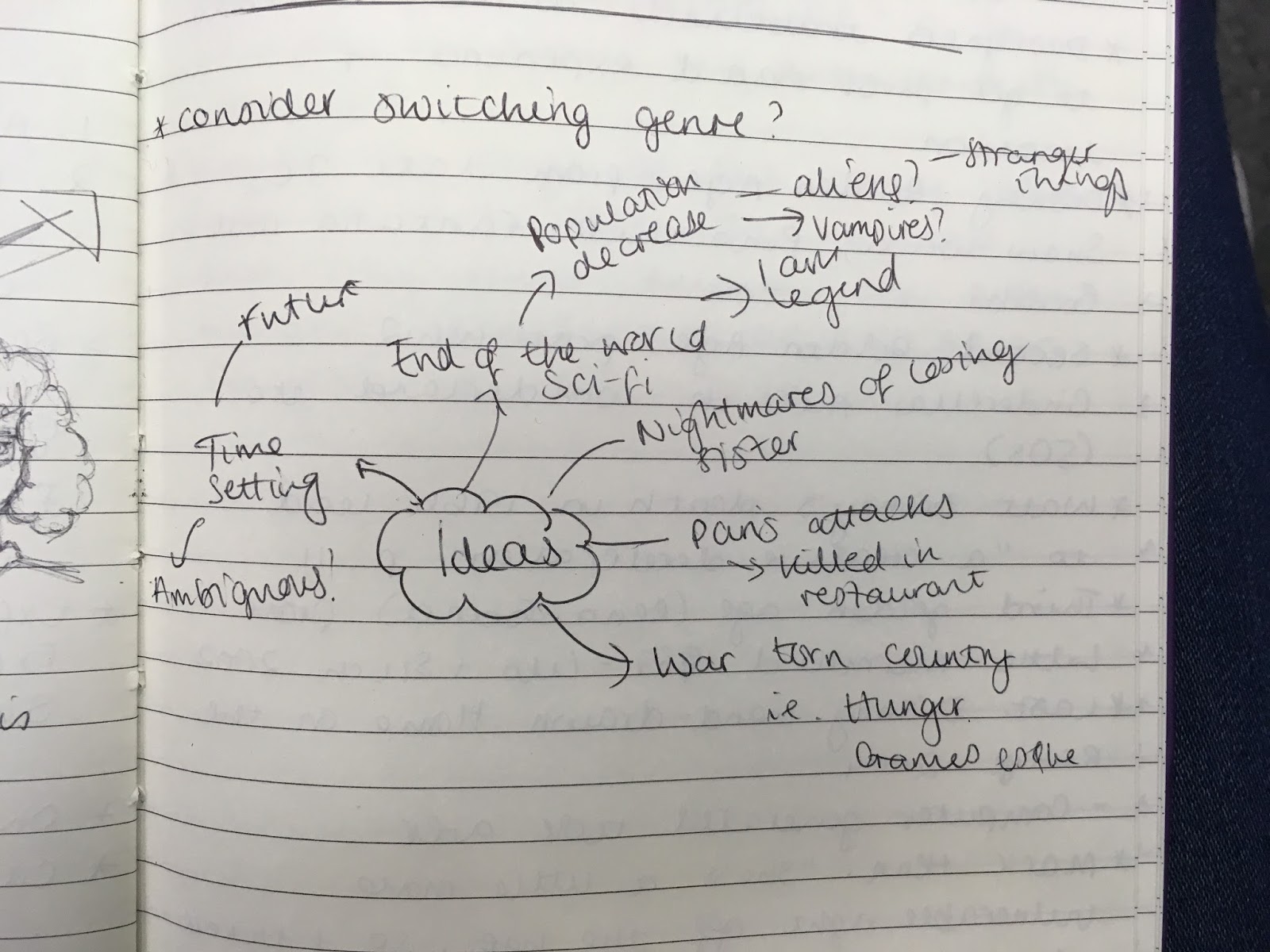
The idea was sparked by thinking of the setting first. I chose Paris since I'd visited the city twice last year and found it to be really beautiful. Yet since then there has been a number of terror attacks in Paris and other places in France. Subsequently there's been an increased amount of security. This made me think: what if the terror state increased so much that the population was largely wiped out.

In terms of narrative, I've thought about using two parallel storylines of the past and the present. I haven't fully thought through the narrative but would like to make it based upon a family. I don't want there to be a love interest. I haven't decided whether I'd like the apocalypse to be caused by terrorists or if I'd like to go more down the sci-fi route and have an alien/zombie/vampire presence.

For the design of the project, I'd like to use two difference colour schemes to represent the past and the present. I think in the present tense I would use light, washed out colours and in the past tense I'd use much darker colours.

I know I have a lot more to think about, but I plan to do much more research into the genre and the conventions within.
At present I think I will take inspiration from the following films I've already seen:

  • Love (2015): This features a non-linear narrative structure, in which the past and present are obscurely linked. I would like to also look at other films by the same director (Gaspar Noe) such as Enter the Void (2009) and Irreversible (2002) to see how he goes about using narrative structure in those.
  • The Hunger Games: Mockingjay pt. 1 (2014): This fits into the dystopia genre so would be a great source of inspiration. It features an uprising against the state, which could be an interesting story to explore. I'm also inspired by it's accompanying soundtrack with songs such as Yellow Flicker Beat by Lorde and This Is Not A Game by The Chemical Brothers and Miguel. Both those songs heavily feature the use of electronic instruments and the lyrics express feelings of rebellion. This would relate to the past tense narrative in my project in which I'd present the chaos that occurred during the apocalypse. In contrast the song The Leap by Tinashe is much more slow and mellow, yet slightly depressing. The tone reflects that of the present tense in my own storyline.
  • I Am Legend (2007): I think this film would also be good to look at in terms of being a post-apocalypse story.

Wednesday, 2 November 2016

Lecture - Race in the Media (Real Media)

This evening I attended a talk hosted by Real Media about Race in the Media. Real Media is an alternative media organisation that aims to broadcast news stories that tend to be ignored by the mainstream press.

Real Media is a cooperative of journalists dedicated to public interest journalism and challenging mass media distortion. We believe the large media organisations, as they currently exist, largely serve the interest of a small establishment – their owners, their advertisers and the governments that they get most of their information from. This pattern of ownership and structure results in a narrowing window of debate and the decline of public interest journalism. We exist to challenge this state of affairs.http://realmedia.press/real-media/about-us/

Although the talk was quite journalism based, I still found the issues raised to be interesting and relevant to all aspects of the media.


Maya Goodfellow (Media Diversified)
  • 94% of journalists in the media are white
  • White males tend to get paid more
  • We don't see ourselves represented
  • This enforces the ideology that whiteness is the norm
  • The media doesn't just create stereotypes but reflects those present in society
  • We are presented with the idea of whiteness in opposition to "the other"
  • The backlash of Brexit featured attacks on numerous people of colour
    - highlights how many consider the British identity to be tied with whiteness
  • Scientific racism being rejected whilst cultural racism embraced (in media)
  • We need education on racism/history to move forward
  • Recommended reading: The Good Immigrant
  • The Grammar of Racism Stuart Hall
Roxley Foley (Aboriginal activist)
  • UK always linked to Australia
  • 'The White Australian Policy' aims to keep Australia 'pure'
  • Nazi Dreamtime (book)
  • One of the highest levels of media ownership
  • News claims of mass sexual predators in aboriginal communities
    - police raided them
  • Aboriginal land passed over
  • Aboriginals considered a "burden"
  • Death (murder) in custody
  • ABC news concealing info/evidence 
  • Bill Leak - mocking events in cartoon
Anu Henriques (from Skin Deep Magazine)
  • People of colour connoted as homogenous within the media
  • They're often tokenised
  • Important to consider who curates our culture
    i.e. white media creators will tell white stories
  • Alternative media - allows POC to tell their stories in own words
  • The media not just for entertainment
  • Doesn't just have to talk about race
  • Anu prefers to present POC in positive ways not negative
    - troubled by viral videos of POC being killed
    - subsequently shared images of success stories (Serena Williams wining grand slam) 
  • Slow journalism - constantly expect news
    - We need more 'non-reaction' news - beyond clickbait
  • Delayed gratification
    - we need more in depth analysis of issues
    - discuss why the problems are occurring
  • Success o Black Lives Matter
    - pushing for policy change
Joseph Guthrie (Media Diversified)
  • Racial issues are not just exclusive to the US
  • "Travel is the best educator" - Akala
  • Separatism - they already have an interpretation in mind
  • British media - over simplification of issues
    - The media fails to properly analyse what's happening in terms of race
    - Worried they'll face backlash
  • Our police aren't as militarised as US but those from BAME backgrounds are still more likely to die in police custody
Final thoughts:
As a woman of colour aiming towards working within the media, I feel like it is my duty to be able to tell my own experiences. This is why I am likely to include black, female characters within my own project. As Anu said, these discourses don't even need to particularly be about race and issues surrounding it, but just the inclusion of minorities helps a great deal. I think it's important to be able to present people of colour without negative connotations in order to help change the way they're treated in society.

Reading: The Art of Princess and the Frog

I found this book in the library, about the making of Disney's The Princess and the Frog (2009). I'm a big fan of the film because it's setting is visually pleasing. The protagonist, Tiana, was the first black Disney Princess, marking a huge progression for the company. The aim of the film was to be "a musical no less, featuring an African American heroine set in the Jazz Age". Personally I always appreciate this film for that reason. Growing up I felt a bit left out when my friends would dress up as their favourite Disney Princesses, but there were never any that looked like me. Therefore I think that representation is important within the media, especially for young kids.

Animator, Mark Henn, described Tiana as being "a little more vulnerable right off the bat, so I think you can more easily identify with her or want to cheer her on". She subsequently follows the trope of being an underdog, which gives the audience hope. The book also explains that Tiana is similar to Mulan in such she "has her own motivating desire and decisions that drive her and make her interesting and sympathetic". I thought this was an interesting point, since Tiana and Mulan and two of my favourite Princesses that similarity is probably why I like them both. Their traits align with postfeminist qualities, making them great female role models. In my own narrative I will have a female protagonist and I'd like the audience to be able to relate to her through a feminist perspective.


The Princess and the Frog was Disney's final hand-drawn animation. The last hand-drawn animation before that was Home on the Range (2004). This is one of the reasons why I thought it was relevant to my own project as I will be hand-drawing most of my imagery before digitally animating. The majority of mainstream animated films are now CGI and 3D, so I had to ask myself where would my animation fit into a contemporary market. However The Princess and the Frog demonstrates how the resurgence of seemingly outdated practices can still be relevant.


The designers travelled to New Orleans to get first hand experience of location. I would like to base my animation in a place that I've already been to; if not I'd like to travel to the setting. I think it's important to have an understanding of setting to be able to fully put yourself in the character's shoes. 
The art design was also inspired by style of the early 1900s such as art deco, art nouveau and "the ethnic American art from Harlem renaissance artists". Inspirtation was also taken from real life architecture, similar to the style used in Lady and the Tramp (1954). "They took something that incredibly complex and painted only what was important". I will take this into consideration which designing my own locations in order to avoid overcomplicating them.


In terms of colour design, the artists tried to avoid a lot of overt style. The imagery above is during the musical number for Almost There in which the aesthetic is changed from the rest of the film. I used this scene as inspiration when using Toon Boom for the first time (see post: ToonBoom test). I love the use of flat design and the warm colour scheme. The scene was supposed to look like a 1920s poster brought to life. 

They also took inspiration from Impressionist artists and their use of light; "their whole lives were devoted to trying to capture light, and the feeling of air between the viewer and the subject". They stated that the use of lighting makes it feel realistic. In my own animation, I'd like to pay close attention to lighting, as this was something I didn't put into consideration in my last animation project.

"Effects animation is anything that moves that isn't the characters, and is typically environmental, such as water, fire, smoke, explosions - or pixie dust". The animators paid careful attention to this and how it affects the characters.


I included the image above as a reference to myself in creating my storyboard. They have put in so much detail into the characters expressions so that you can tell what movement is taking place. I would like to use a similar amount of detail when creating my pilot.

Brainstorms

Trying to come up with an idea...


I made a brainstorm of different genres, in an attempt to cancel out the genres that I don't not wanted to do. I'm leaning more towards sci fi and fantasy. I divided this is to sub genres. 


I decided on dystopia and tried to break down the conventions of the genre. I also starting coming up with an idea from within the genre


Here I further brainstormed my ideas and inspiration to do with it. 


Finally I started to think more about how genre is used in animation most animations tend to be aimed at family and are typically comedy. I didn't want to do this so thought about what other genres are used in animation and if I was inspired by them

Tuesday, 1 November 2016

Workshop 7

Project Proposal


I don't really have an idea for my project yet. I would like to go with the sci-fi/fantasy genre. I'm considering doing an adaptation of an already existing narrative. I'm inspired by Angela Carter's The Bloody Chamber and how she adapts fairytales and makes them dark.


I've been inspired by the film Somewhere Down the Line by Julien Regnard. I like the colour palette he's used and the use of flat design.


I presented by experiments to the class.


I haven't thought too much about sound yet, however I'd quite like there to be minimal, if not no dialogue. I'm inspired by the use of sound in The Soundman.

Since I didn't really have an idea, it was difficult to get feedback from the class. However Mary suggested that I experiment with using muted colours rather than pastels. In addition, Gaby suggested that I research Stephen King's 'Million Dollar Babies', which are stories that are available for students to develop for a small cost of $1.